Designing a file browsing component
This is a case study explaining the context in which the Tree View component was designed and built, whilst working as a designer for The National Archives.
My role
I designed and facilitated the workshops that involved Jobs to be Done stories which you can see below. I was then responsible for design decisions, UI/Interaction design and front-end build for this component. This was also an opportunity to advocate for the creation of a component library within our product team. I was helped by a colleague in the development team to set up the component library as per GDS standards, however I later added Storybook.
Background and context
In digital archiving there are various scenarios that require the presentation of a hierarchical file structure to the user. For digital records the preservation of the original folder and file structure is an important way of retaining meaningful context. This adheres to the principles of preservation and helps to make the documents more accessible for future use.
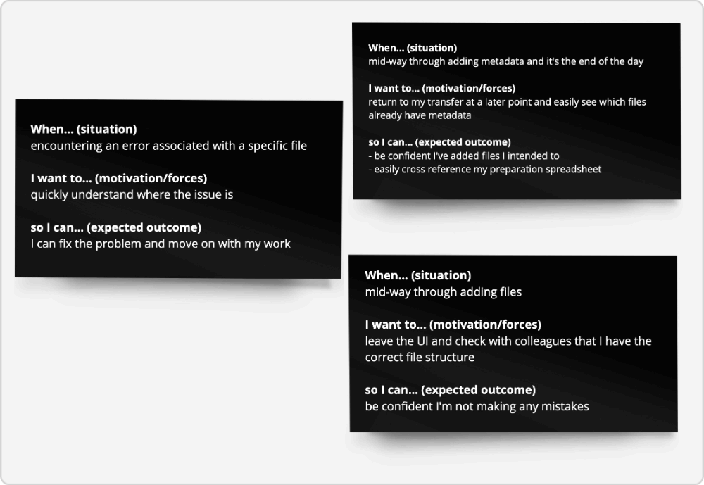
When a consignment of digital files is being uploaded through our UI we need to present the original folder and file structure back to the user. We discovered how important this was during a workshop I facilitated. Working with user research and interviews with front-stage staff we devised some Jobs to be Done stories that emphasised the importance of reviewing and easily navigating folders and files.
There are many ways to design an interface to accomplish this. During the preparation for this design task we discussed and experimented with two:
- One folder per page:
First, presenting only the root directory, which may consist of files and more folders. Each time a user selects a directory a new page is loaded showing the content of the new folder. We only ever show the content of one folder at a time. - The Tree View:
Presenting all the files in a nested 'tree view' with collapsible and expandable folders, so that files in different folders can be seen in one view.
There are positives and negatives to both options to do with accessibility, efficiency, and complexity.
UI Patterns
Both Finder (macOS) and File Explorer (Windows) have been dealing with the UX of file management for a long time. They make multiple options for file exploration available and configurable to the user, including tree, column and single page views. It was useful to assess how the UI design pattern works in an operating system since this is a familiar method for most people to manipulate and explore files and folders.
Other examples where working with files is prevalent is cloud storage services, such as Dropbox and Google Drive. In each of them there is a similar set of configurable options between single page and tree view presentations.
User needs & decisions
User research led us to believe that users could often be browsing deeply nested folder structures. The 'one page per folder' option would make this challenging for a number of reasons. This narrow view of the consignment would make it challenging to locate oneself in the hierarchy and individual page refreshes when navigating in and out of deeply nested structures would become time-consuming and onerous. The ability to see the folders opening and closing without any delay and in one viewport also helps to keep track of their current position, which is good for the findability within the component.
The hierarchical tree view was the UI and interaction pattern that most suited the user needs, providing a wider or macro view of the folder structure, helping with find-ability and making navigation through directories trivial.
Design
View and copy the component in this open Figma file. It is based on the GDS Figma community file.
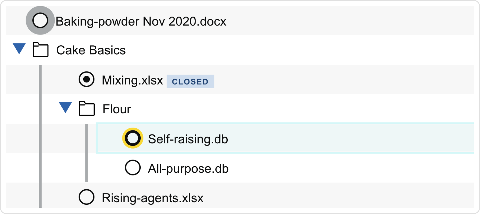
The UI design leans on GDS styles and composites existing components such as radio buttons or checkboxes. The component hover and focus states were adapted, and the visual indicators for focus made much more prominent because of the detailed specifications around keyboard controls. You can see this in the Single Select Example in Storybook .
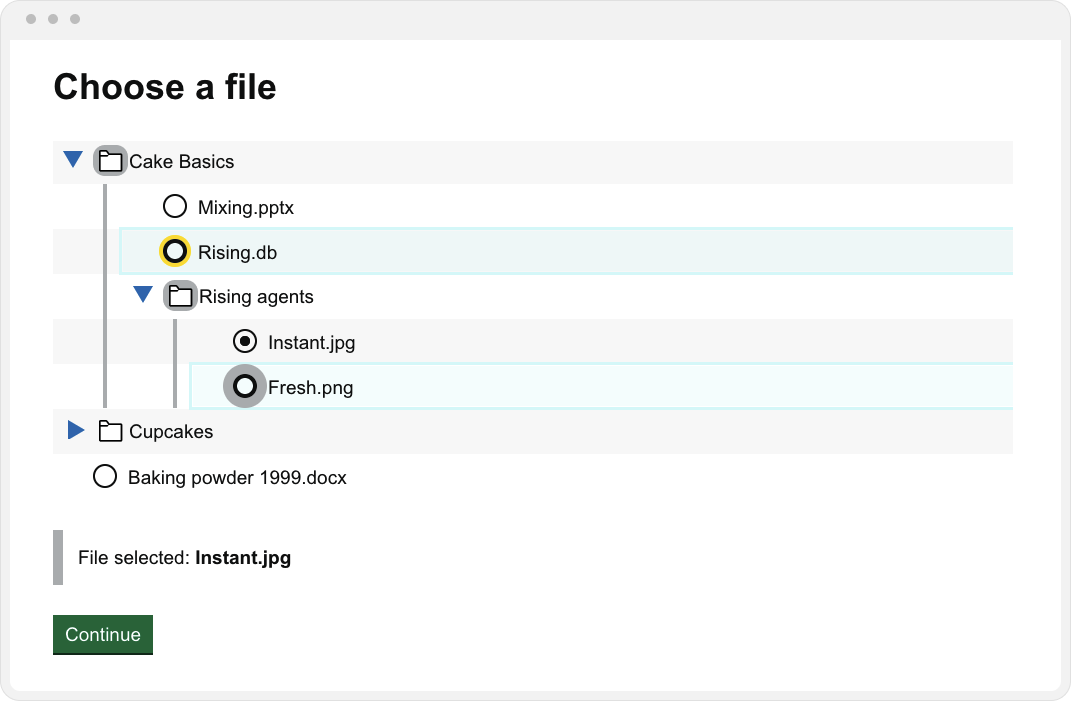
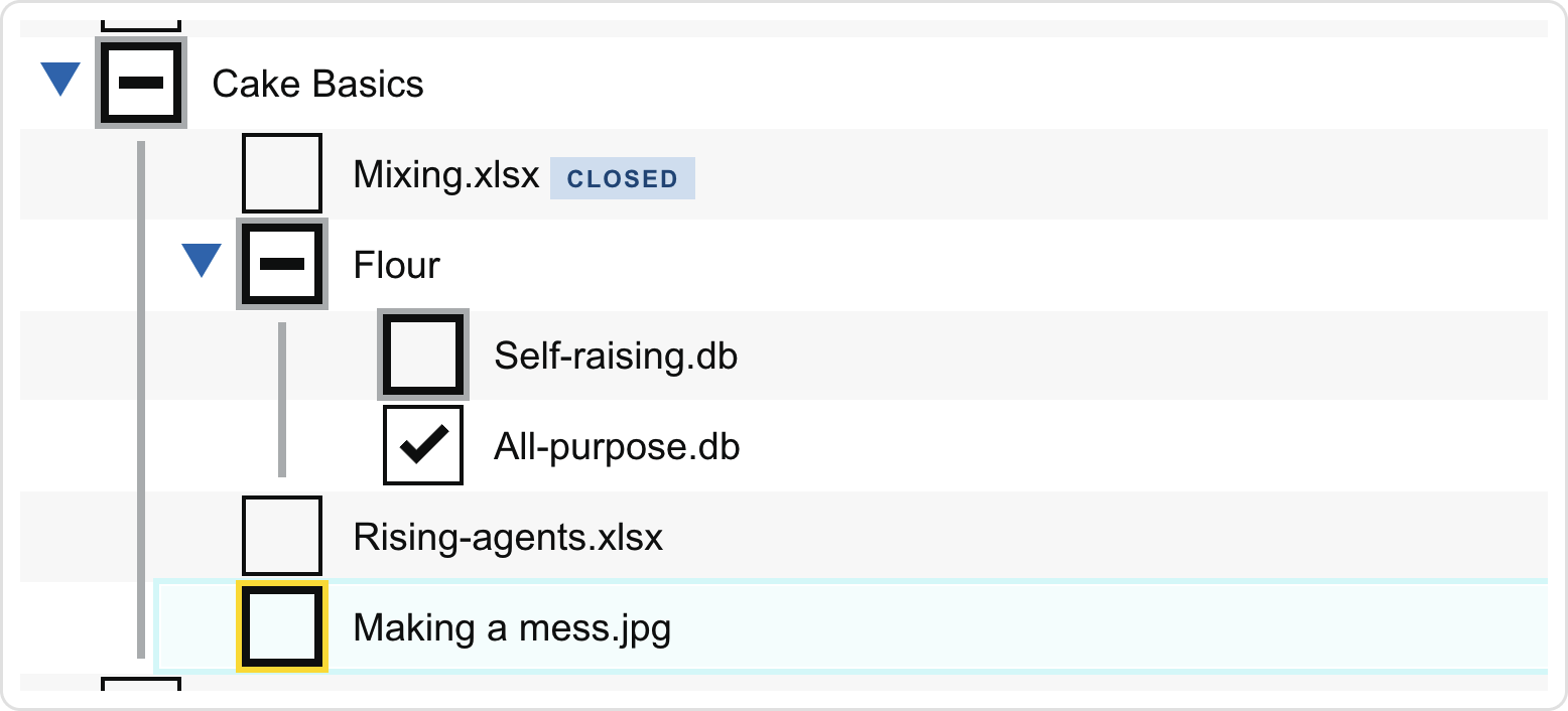
Other differentiated visual states included showing relationships between the active child and the parent directories and indeterminate checkbox states, for scenarios when multi-select. This can be seen below and in the Multi-select example in Storybook.
More than in most of my previous work the devil was in the details of fine-grained interactions and visual states supporting accessibility. The relevant WCAG rules were Non-text Contrast (1.4.11) and Focus Appearance (2.4.11).
Tree View pattern
The common design pattern for this type of display and interaction is conveniently called the 'tree view'. This has an equivalent ARIA role and implementation guidance from ARIA Authoring Practices Guide (APG), Mozilla Developer Network (MDN) and various design systems.
The ARIA Authoring Practices Guide contains detailed specifications about ARIA roles, states and properties, which need to be implemented. It also lists a very detailed keyboard control specification, which can be seen and tested in this Storybook example.
Despite it's complex appearance the HTML for a nested set of folders is a simple nested list. Following progressive enhancement standards we would first of all render all HTML files as below. This can be styled so that when JavaScript is disabled the UI renders all folders expanded and includes a sensible presentation to indicate the hierachical relationship.
<ul>
	<li class="dir">Cakes
		<ul>
			<li class="file">Baking powder 1999.txt</li>
			<li class="file">Baking powder 2022.txt</li>
			<li class="dir">Basics techniques</li>
		</ul>
	</li>
	<li class="file">Shopping list.txt</li>
	<li class="dir">Winter Recipes
		<ul>
			...
		</ul>
	</li>
</ul>
With JavaScript enabled the folders are collapsed by default, all ARIA states are updated during interactions and keyboard controls are enabled.
Accessibility
There are some concerns about the efficacy of the Tree View pattern from an accessibility standpoint. This has been discussed on the X-Gov Slack. We took this concept forward despite these concerns because we currently have a tiny user base of approximately 15-20 users who we engage with before they use of the product.
This gives us a lot of opportunity to review the use of the Tree View in user and accessibility testing. The component was part of a DAC accessibility audit, which recognised that it was a custom component and therefore an accessibility risk. They also acknowledged the esoteric nature of the tasks required in the interface.
I implemented the recommendations from DAC and included other accessibility improvements which we discovered in usability testing with screen reader users.
We will soon conduct isolated tests on the component again. There is a possibility that this will prove that the tree view pattern is not well supported enough in some assistive technology and at this point we will have to consider our options and other routes/designs for file selection.
So far we have mostly focussed on ensuring Windows screenreader software, primarily NVDA, works most effectively with the tree view - as per the DAC audit. We have also done some testing with JAWS. However, there are some issues within Voiceover on Mac that cause the tree view to be treated incorrectly. This is explained in more detail here:
Accessibility WTF: Voiceover on Mac announcing a list tree as a table? Christian Heilmann
Currently, we do not expect many of our Civil Service users to be working on Macs and we also know that screen reader users predominantly use Windows so this will likely not cause many problems. However, we will monitor this situation and also keep in mind that even one of our users being prevented from using the component is too many.